Elements
(Starting with the postcard in the upper left and going left to right down each line)
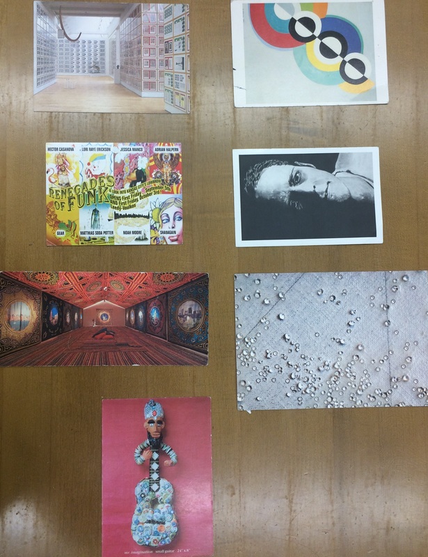
1. Line- This postcard has many vertical and horizontal lines all over the postcard.
2. Shape- This postcard uses the geometric shape of a circle to create the image.
3. Color- There is a wide variety of colors on the spectrum throughout this postcard.
4. Value- This postcard was a good example of value because one side is completely black and it fades to make the face in white.
5. Space- The artist used negative space to create the feeling of space in this postcard.
6. Texture- The water droplets on the tarp make this postcard look real.
7. Form- This postcard makes you think that you could pick up the object if it was in front of you.
(Starting with the postcard in the upper left and going left to right down each line)
1. Line- This postcard has many vertical and horizontal lines all over the postcard.
2. Shape- This postcard uses the geometric shape of a circle to create the image.
3. Color- There is a wide variety of colors on the spectrum throughout this postcard.
4. Value- This postcard was a good example of value because one side is completely black and it fades to make the face in white.
5. Space- The artist used negative space to create the feeling of space in this postcard.
6. Texture- The water droplets on the tarp make this postcard look real.
7. Form- This postcard makes you think that you could pick up the object if it was in front of you.
Principles
(Starting in the upper left hand corner and going from left to right on each line)
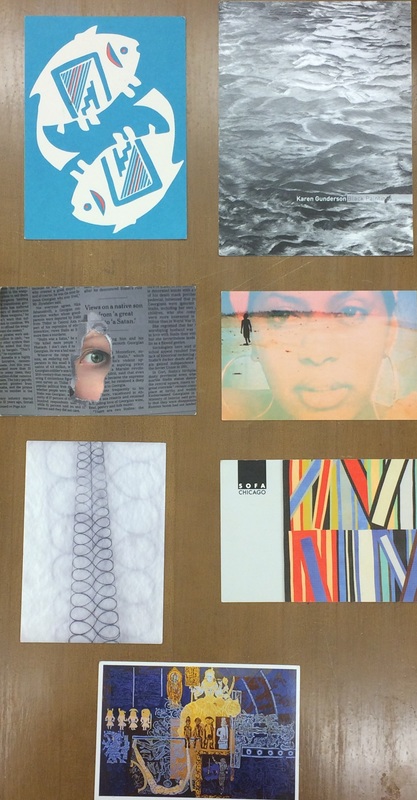
1. Balance- This is a good example of balance because the fish are symmetrical and balance each other out.
2. Contrast- The black and white of this postcard contrast each other well.
3. Emphasis- The distinct focal point in this postcard is the eye and that is the emphasis of the piece.
4. Movement- This postcard makes your eyes go in a specific route after the focal point; from the woman to the shadow.
5. Pattern- This postcard uses lines to create a figure eight pattern on this postcard.
6. Rhythm- There is a straight, rough rhythm from the use of straight lines on this postcard.
7. Unity- This blues and yellows contrast each other, there is texture in this piece, value from the different shades of blue and yellow, there is a good use of straight and curvy lines, color is bright, there is positive space, and all of these elements and principles make this postcard look complete.
(Starting in the upper left hand corner and going from left to right on each line)
1. Balance- This is a good example of balance because the fish are symmetrical and balance each other out.
2. Contrast- The black and white of this postcard contrast each other well.
3. Emphasis- The distinct focal point in this postcard is the eye and that is the emphasis of the piece.
4. Movement- This postcard makes your eyes go in a specific route after the focal point; from the woman to the shadow.
5. Pattern- This postcard uses lines to create a figure eight pattern on this postcard.
6. Rhythm- There is a straight, rough rhythm from the use of straight lines on this postcard.
7. Unity- This blues and yellows contrast each other, there is texture in this piece, value from the different shades of blue and yellow, there is a good use of straight and curvy lines, color is bright, there is positive space, and all of these elements and principles make this postcard look complete.
 RSS Feed
